Generating HTML Reports with Anovos
The final output is generated in form of HTML report. This has 7 sections viz. Executive Summary, Wiki, Descriptive Statistics, Quality Check, Attribute Associations, Data Drift & Data Stability and Time Series Analyzer at most which can be seen basis user input. We’ve tried to detail each section based on the analysis performed referring to a publicly available Income Dataset.
Executive Summary

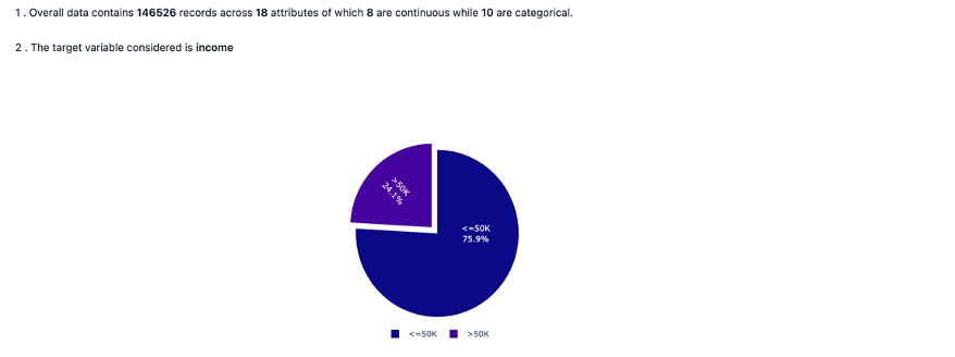
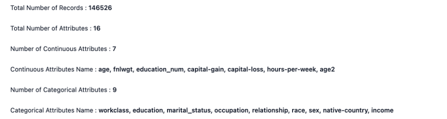
The Executive Summary gives an overall summary of the key statistics obtained from the analyzed data such as :
- dimensions of the analysis data
- nature of use case whether target variable is involved or not along with the distribution
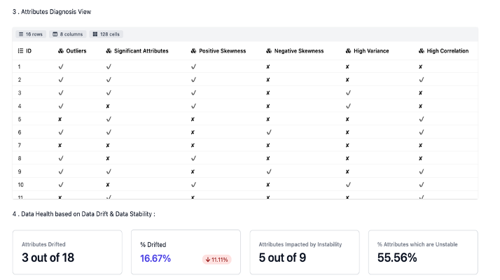
 - overall data diagnosis view as seen across some of the key metrices.
Wiki

The Wiki tab has two different sections consisting of:
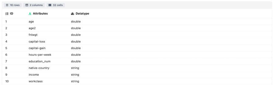
- Data Dictionary: This section contains the details of the attributes present in the data frame. The user if specifies the attribute wise definition at a specific path, then the details of the same will be populated along with the data type else only the attribute wise datatype will be seen.
- Metric Dictionary: Mostly containing the details about the different sections under the report. This could be a quick reference for the user.
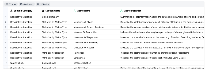
Descriptive Statistics

The Descriptive Statistics section summarizes the dataset with key statistical metrics and distribution plots through the following modules:
-
Global Summary: Details about the data dimensions and the attribute wise information.
-
Statistics By Metric Type includes the following modules:
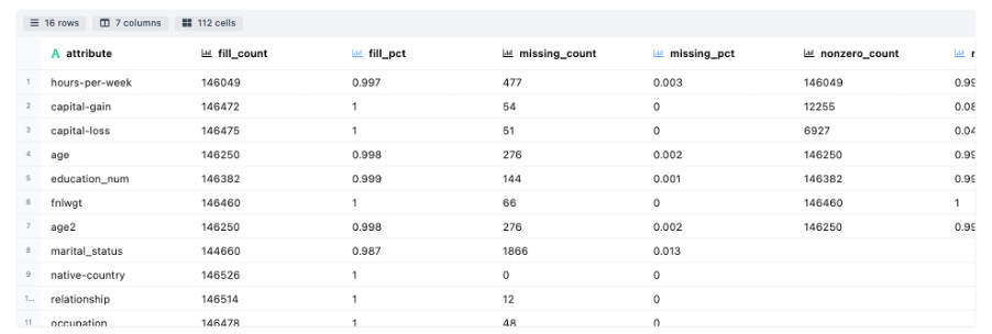
- Measures of Counts : Details about the attribute wise count, fill rate, etc.
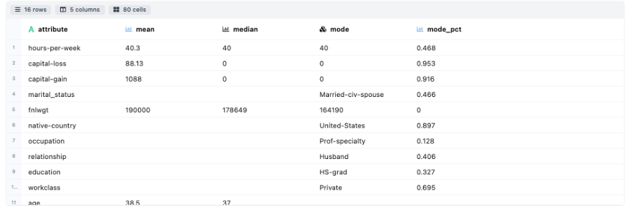
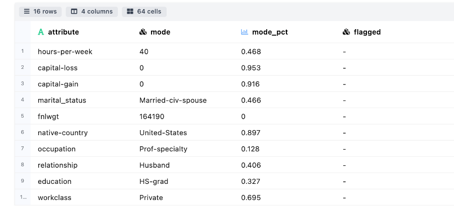
- Measures of Central Tendency: Details about the measurement of central tendency in terms of mean, median, mode.
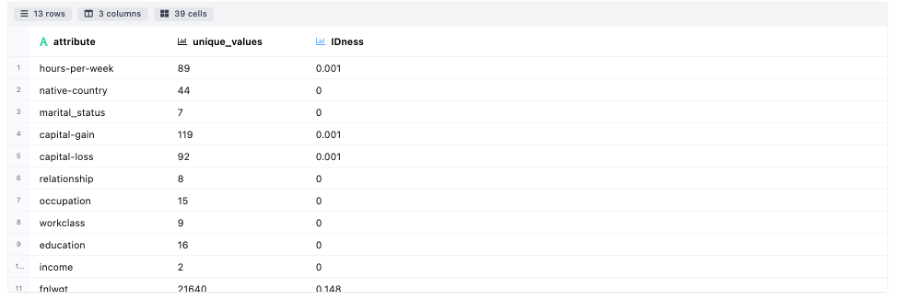
- Measures of Cardinality: Details about the uniqueness in categories for each attribute.
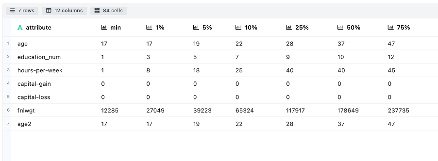
- Measures of Percentiles: Indicates the different attribute value associated against the range of percentile cut offs. This helps to understand the spread of attributes.
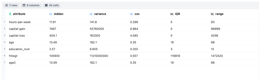
- Measures of Dispersion: Explains how much the data is dispersed through metrics like Standard Deviation, Variance, Covariance, IQR and range for each attribute
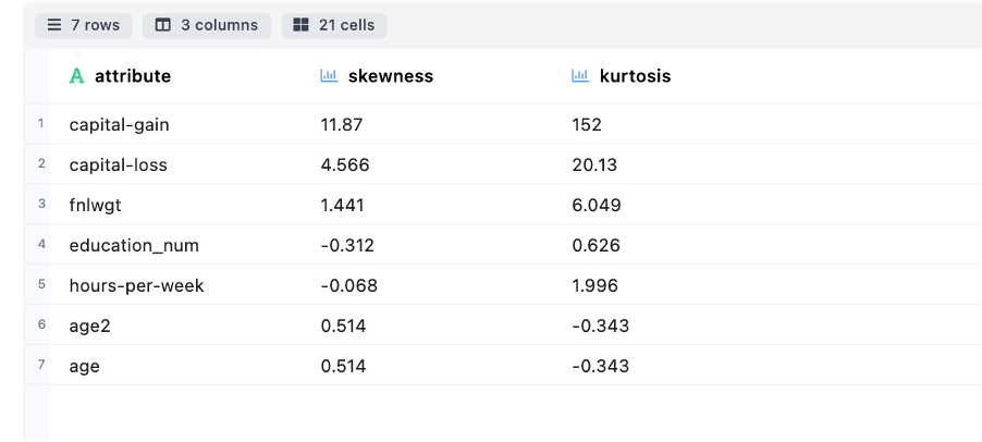
- Measures of Shape: Describe the tail ness of distribution (or pattern) for different attributes through skewness and kurtosis.
- Measures of Counts : Details about the attribute wise count, fill rate, etc.
-
Attribute Visuations includes the following modules:
-
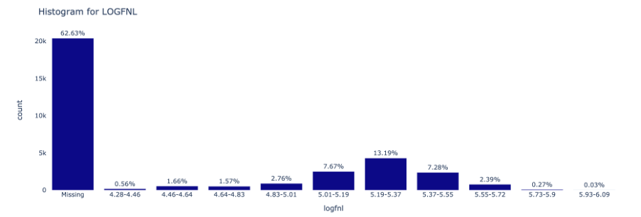
Numeric: Visualize the distributions of Numerical attributes using Histograms
-
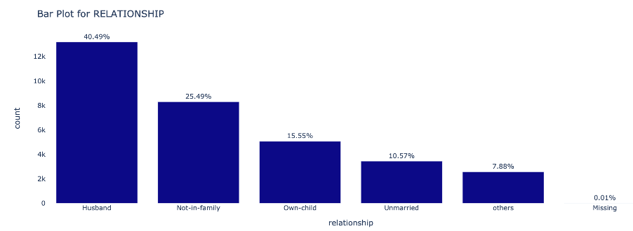
Categorical: Visualize the distributions of Categorical attributes using Barplot
-
Quality Check

The Quality Check section consists of a qualitative inspection of the data at a row & columnar level. It consists of the following modules:
-
Column Level
-
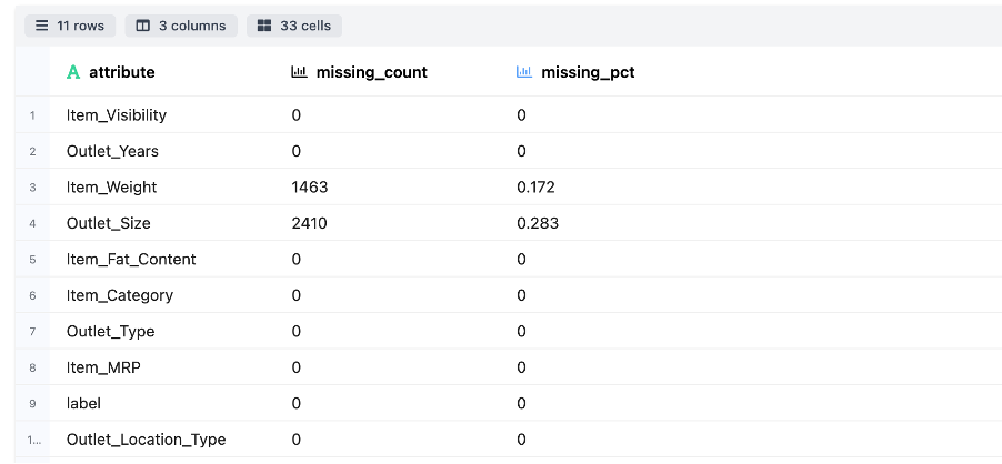
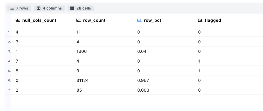
Null Columns Detections – Detect the sparsity of the datasets, e.g., count and percentage of missing value of attributes
-
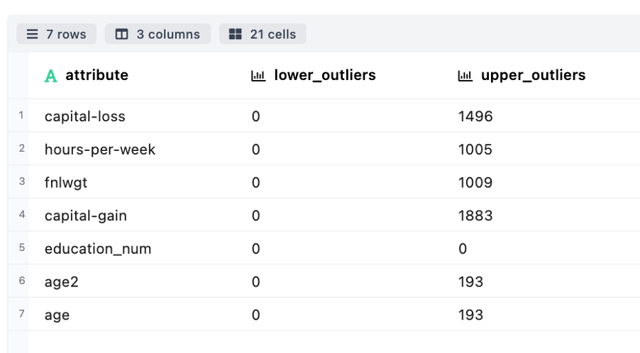
Outlier Detection – Used to detect and visualize the outlier present in numerical attributes of the datasets
-
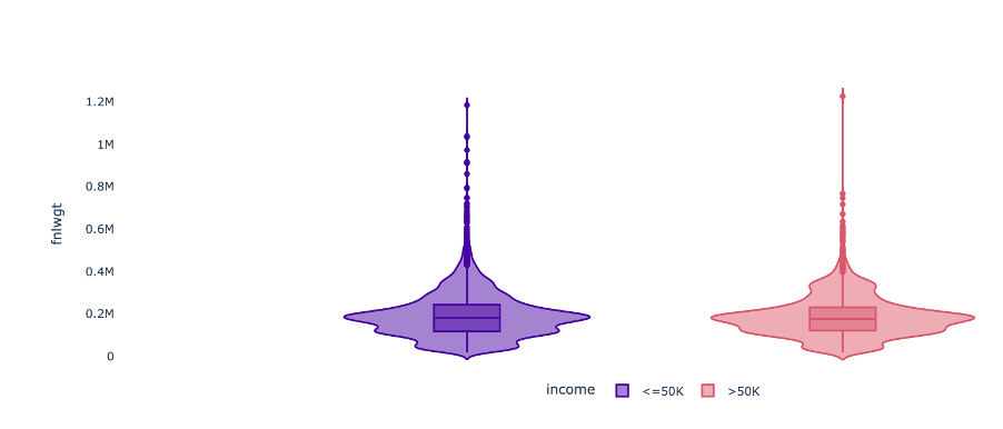
Violin Plot - Displays the spread of numerical attributes
-
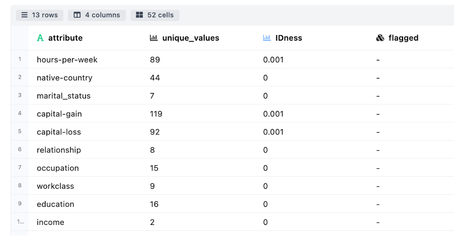
IDness Detection - Measures the cardinality associated across attributes
-
Biasedness Detection - Useful to identifying columns to see if they are biased or skewed towards one specific value
-
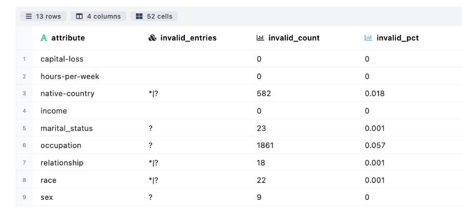
Invalid Entries Detection - Checks for certain suspicious patterns in attributes’ values
-
-
Row Level
- Duplicate Detection – Measure number of rows in the datasets that have same value for each attribute

- NullRows Detection - Measure the count/percentage of rows which have missing/null attributes
- Duplicate Detection – Measure number of rows in the datasets that have same value for each attribute
Attribute Associations

Attribute Associations section details of the interaction between different attributes and/or the relationship between an attribute & the binary target variable
-
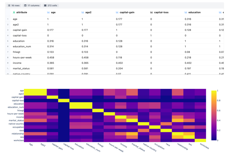
Association Matrix & Plot is a Correlation Measure of the strength of relationship among each attribute by finding correlation coefficient having range -1.0 to 1.0. Visualization is shown through heat map to describe the strength of relationship among attributes.
-
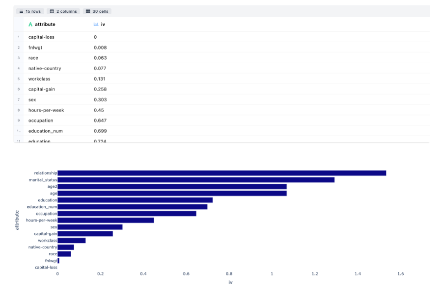
Information Value Computation is used to rank variables on the basis of their importance. Greater the value of IV higher rthe attribute importance. IV less than 0.02 is not useful for prediction. Bar plot is used to show the significance in descending order.
-
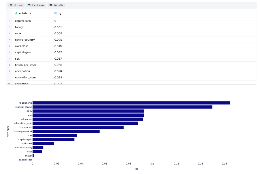
Information Gain Computation measures the reduction in entropy by splitting a dataset according to given value of a attribute. Bar plot is used to show the significance in descending order.
-
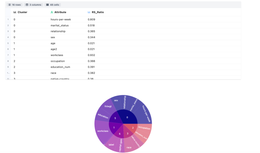
Variable Clustering divides the numerical attributes into disjoint or hierarchical clusters based on linear relationship of attributes.
-
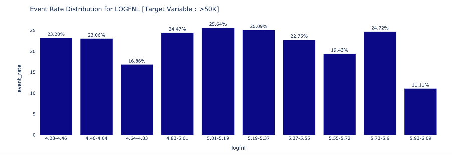
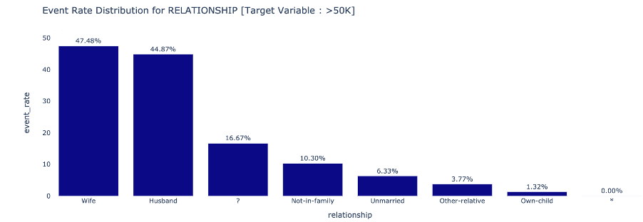
Attribute to Target Association determines the event rate trend across different attribute categories : Numeric
 Categorical
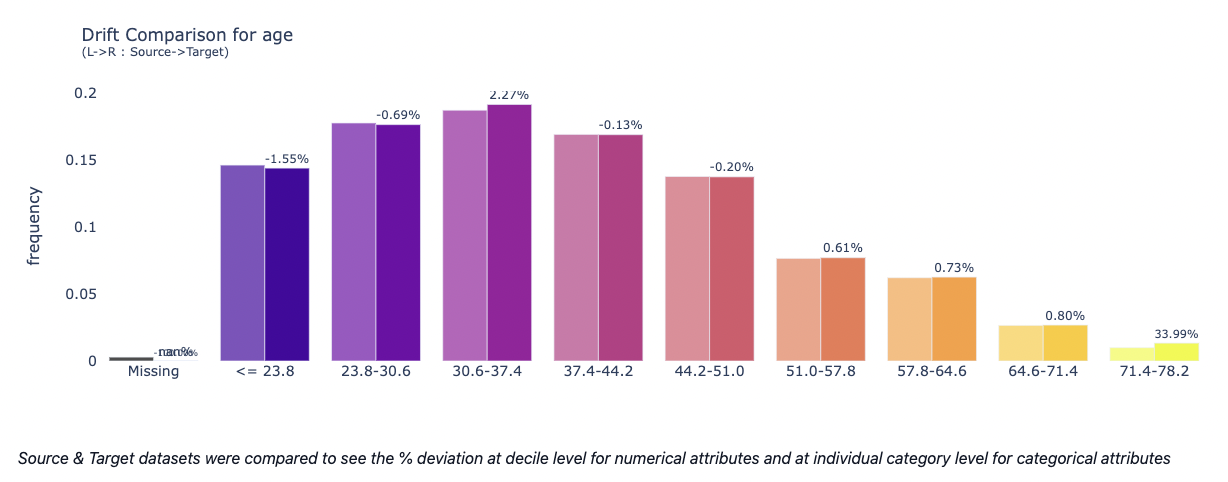
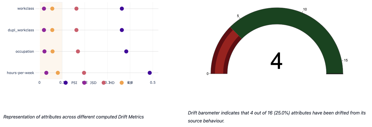
Data Drift & Data Stability
- Data Drift Analysis This module mainly focus on covariate shift based drift detection. The table below describes about the statistical metrics measuring the data drift of an attribute from source to target distribution: Population Stability Index (PSI), Jensen-Shannon Divergence (JSD), Hellinger Distance (HD) and Kolmogorov-Smirnov Distance (KS).
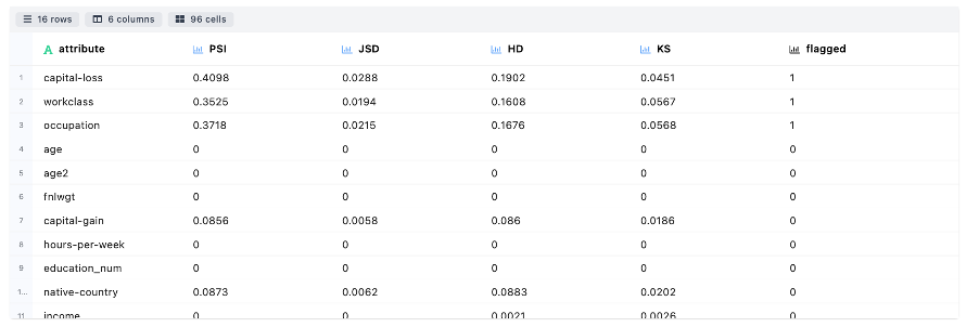
An attribute is flagged as drifted if any drift metric is found to be above the threshold set by the user or 0.1 (default)
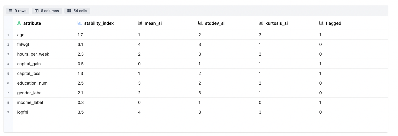
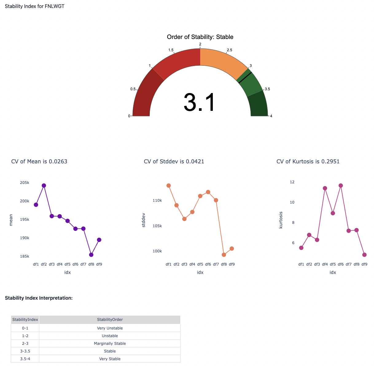
- Overall Data Health
The data stability is represented by a single metric to summarise the stability of an attribute over multiple time periods. For example, given 9 datasets collected in 9 consecutive time periods (D1, D2, …, D9), data stability index of an attribute measures how stable the attribute is from D1 to D9.
- Data Stability Analysis
The major difference between data drift and data stability is that data drift analysis is only based on 2 datasets: source and target. However data stability analysis can be performed on multiple datasets. In addition, the source dataset is not required indicating that the stability index can be directly computed among multiple target datasets by comparing the statistical properties among them.
Attribute wise stability charts have been plotted and the results are being highlighted.
Time Series Analyzer

This section summarizes the information about timestamp features and how they are interactive with other attributes. An exhaustive diagnosis is done by looking at different time series components, how they could be useful in deriving insights for further downstream applications.
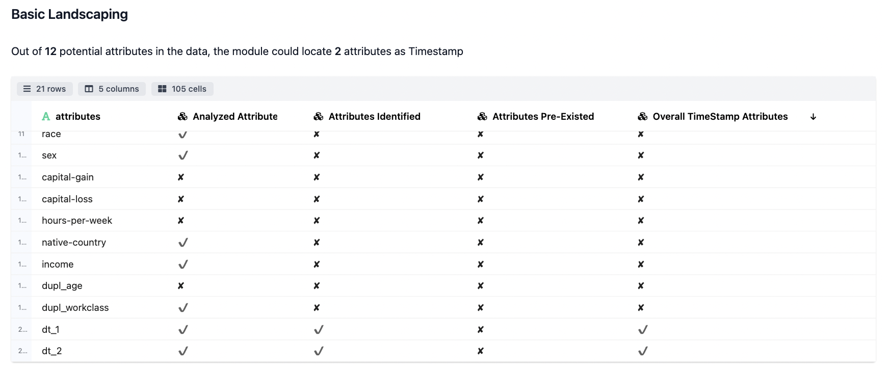
- The Basic Landscaping
The initial analysis details we records where we understand whether a particular field qualifies for Time Series check or not.
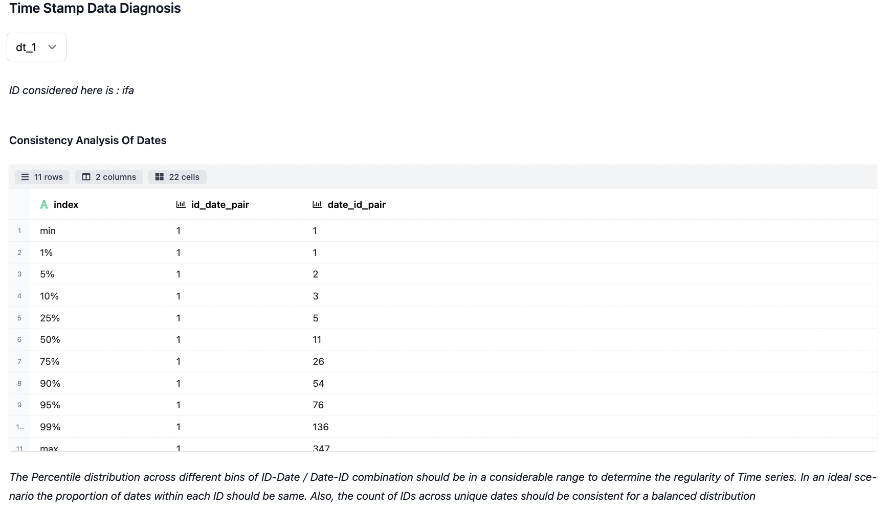
- Time Stamp Data Diagnosis
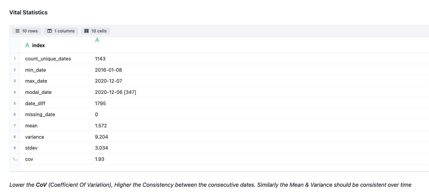
The landscaping & diagnosis work done on the fields which have been auto-detected as time series. Different statistics are taken out pertaining to the association of devices for id_date & date_id pair combination as specified. Additionally, vital stats are also produced.
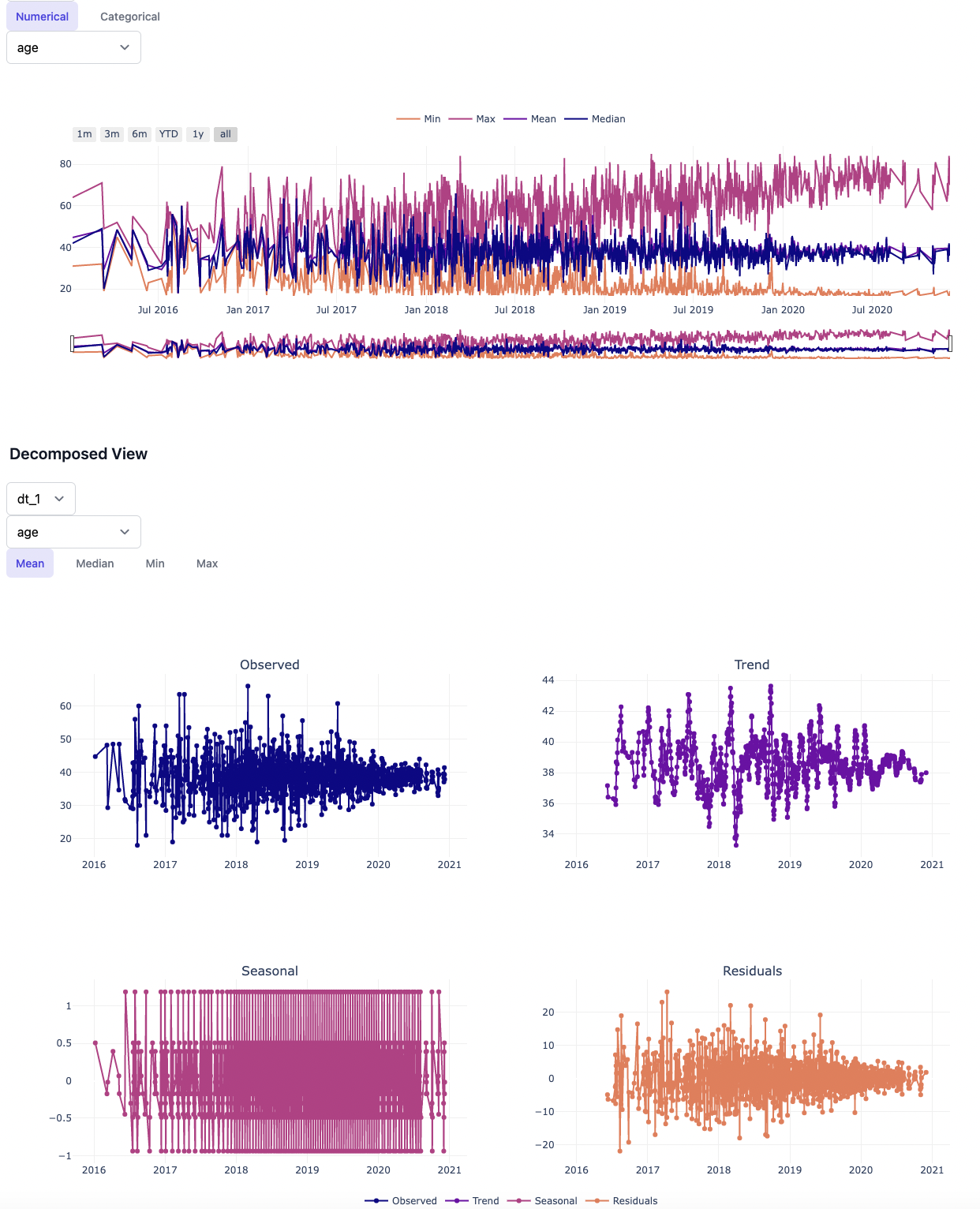
- Visualization across the Shortlisted Timestamp Attributes
The visualization below shows the typical time series plots generated based on the analysis attributes and the granularity of data preferred for analysis (daily, weekly, hourly).
The decomposed view largely describes about some of the typical components of time series forecasting like Trend, Seasonal & Residual on top of the Observed series. Inspecting on the decomposed view of Time Series is supposedly one of the key steps from analysis point irrespective of the model used later.
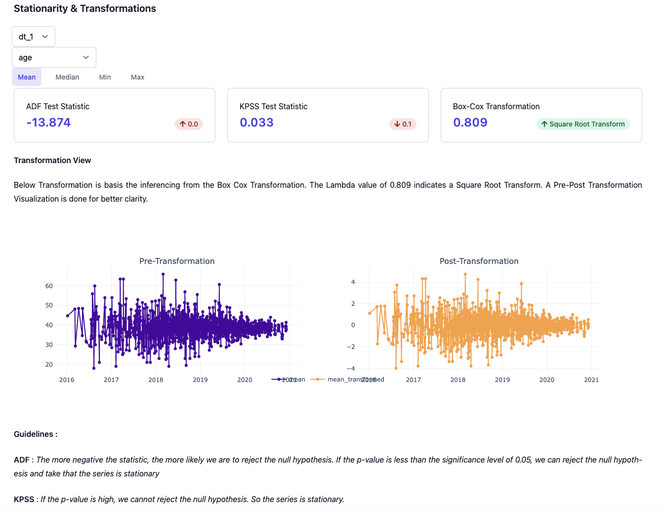
The stationarity & transformation view help us in determinining how much the data can be quantified (through KPSS & ADSS test) in terms of transformation needed to attain stationarity. Additionally, we're showing on how a post transformation view basis Box-Cox-Transformation can be further used in the downstream applications.